PROJECT
Brand Strategy & Identity
CLIENT
Olson Automotive
DATE
May 2022
ROLE
Senior Art Director
New Name, Same Great Service
Marthaler Chevrolet of Redwood Falls is becoming Redwood Chevrolet. Which then changed from Redwood to Olson Auto before the branding project was completed. The sales manager and the general manager weren’t changing anything about the store itself aside from the name and the branding. This is in part due to the already sterling reputation of the dealership (4.9 stars on Google). They are proud of what they’ve accomplished, particularly in the last four years, and don’t want to separate themselves from that and start from scratch.
Redwood Chevrolet isn’t a new beginning—it’s a new look. Otherwise, nothing has changed. It will be the same staff, same leadership, same philosophy as when it was Marthaler.
Our (Cuneo's) mission was to create an identity for Redwood Chevy that builds upon the dealership’s current reputation while setting up future “Redwood” stores for turn-key rollouts.

Challenge
The dealership has historically used the phrase “we make it easy” in marketing, but not consistently. They have competition in neighboring towns where they will often lose customers because they could potentially find the color vehicle they want and/or get another $1-2K on trade-in value. Thus, competing with all of south/southwest Minnesota. Olson, formerly Redwood, wanted to plant their roots in the community and build a brand that streamlines processes anywhere it can to make doing business easy, transparent, and straightforward for its customers.
Outcome
A unique logo that was widely accepted by the automotive dealership authorities and a great start for EasyPunch's hard-working sales team.
Going Through the Motions
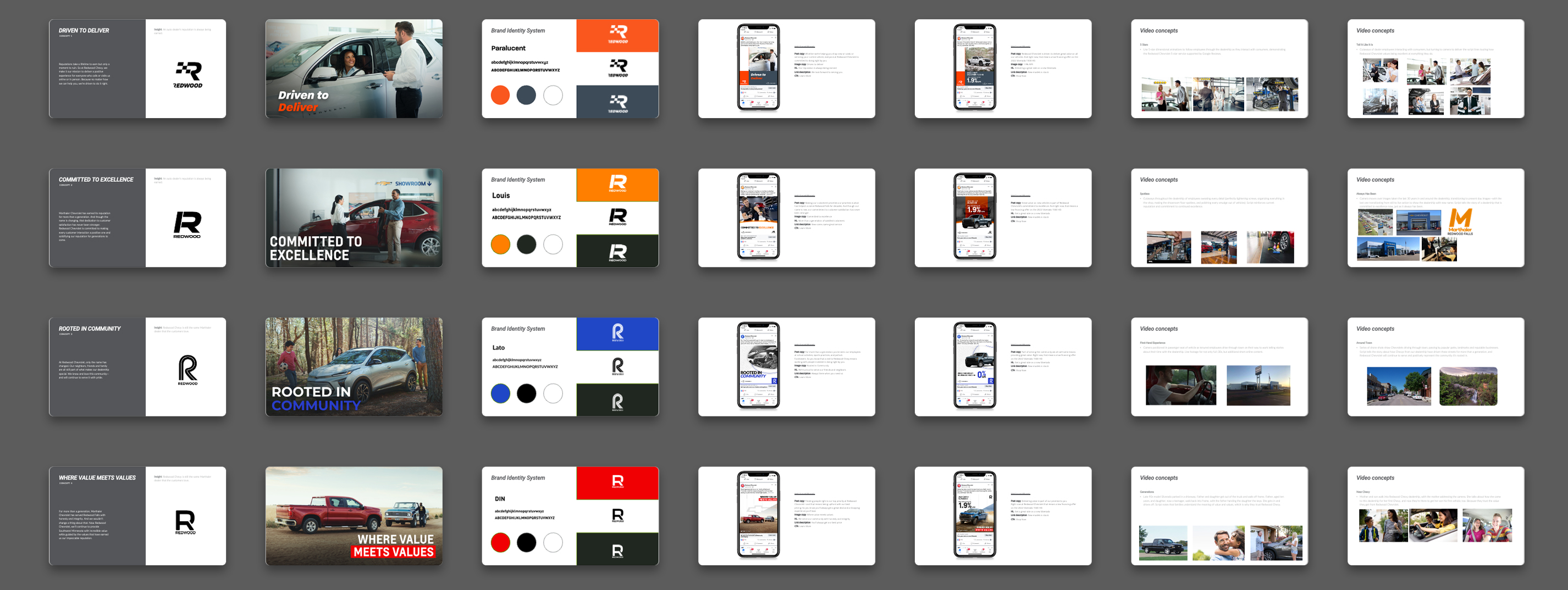
In 2 months, I worked with Cuneo’s creative director (Anthony Maggio) and the senior copywriter (Mike Berger) to execute brand concepts for Redwood Auto Group. Throughout various brainstorming sessions, we landed on 5 initial concepts each with a different perspective on the qualities that Redwood aimed to showcase.
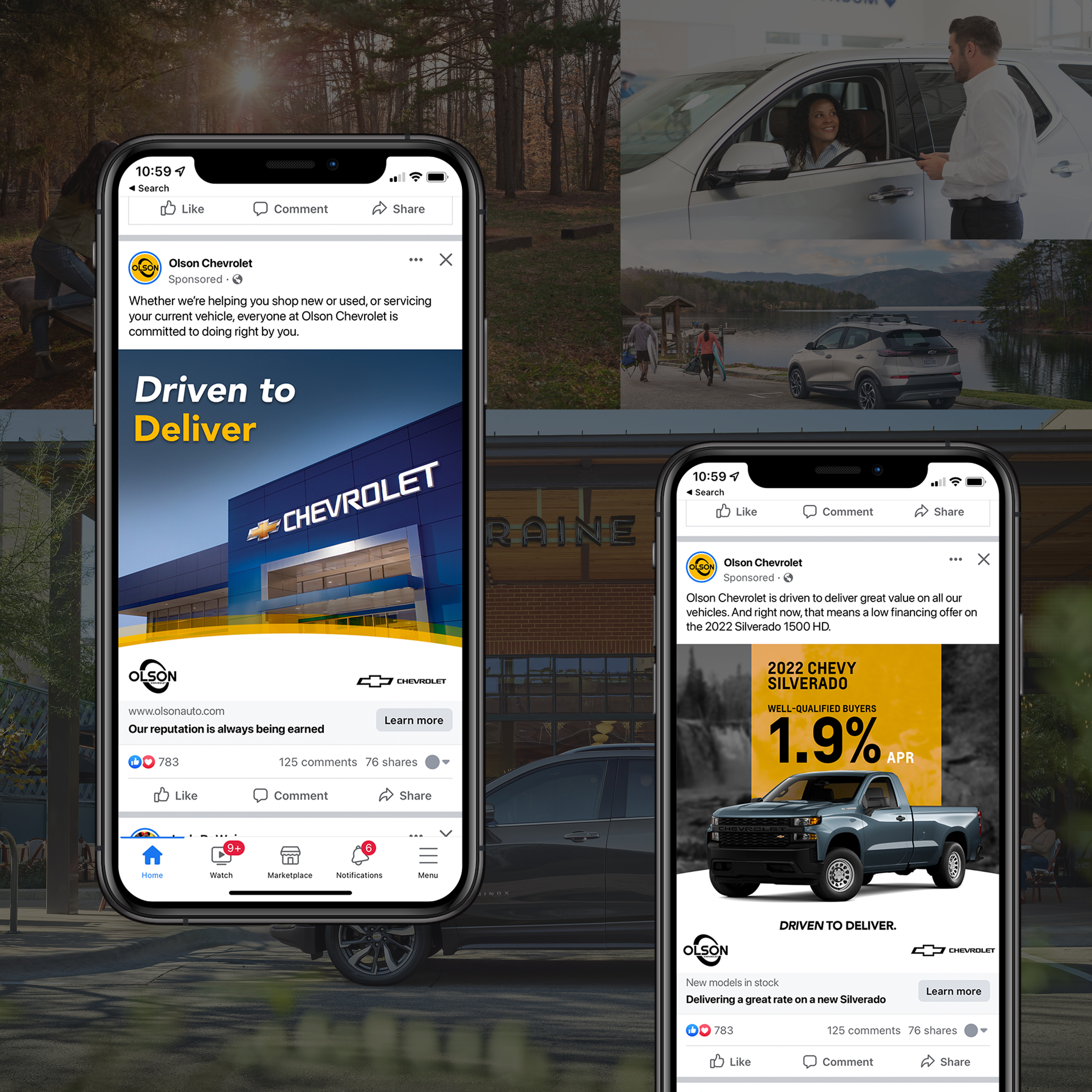
The first round of concepts covered logo, messaging, video concept, and both mid-funnel and high-funnel social media posts. After month one, we presented to the client and landed on a concept they felt covered all the touch points. The caveat was that there was another name change.
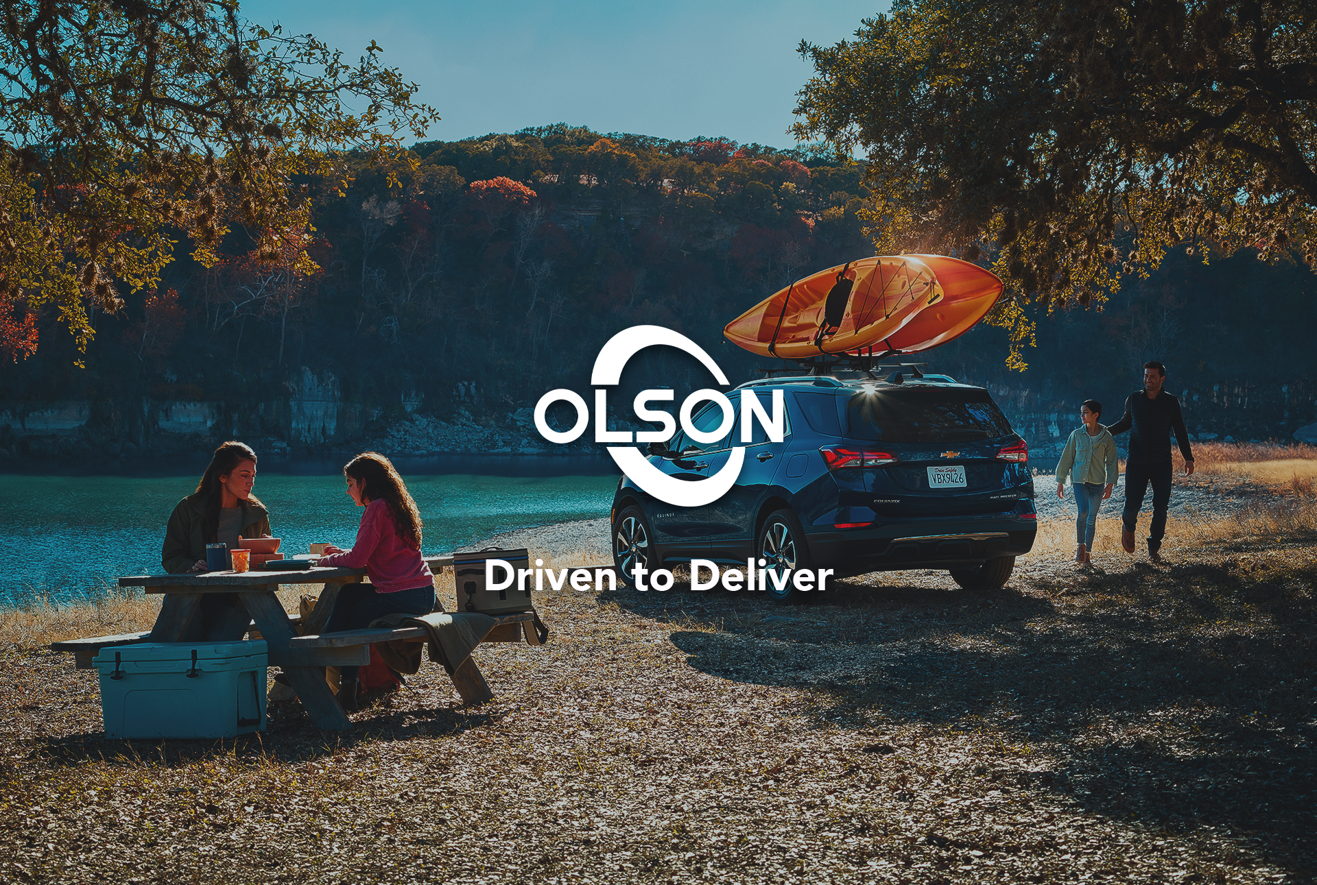
Moving forward with the previously chosen positioning, it was back to the drawing board for logo and design concepts. During this process, we prioritized the capabilities of the client as well as the minimum viable audience to provide a new appealing aesthetic that embodies the “Driven to Deliver” slogan.


From beginning to end — we covered all the touchpoints
Finding my way to a logo that not only contained the brand ethos but also paired well with every OEM rooftop the conglomerate had was difficult but I was successful. To get here, I had to meet the brand where it was. By this, I mean I had to think of the interactions the auto group would have with the OEMs and the expected customer experience when interacting with just the OEM. From here I distilled my findings into a logomark that not only paired nicely with all Olson’s rooftops but also spoke to everything Olson valued.


Design
I approached the design process very carefully since creating separate brands for each audience wasn't an option. The identity had to be agnostic to other OEMs while still standing up as unique against other auto groups in the area.
The typical auto group identity has taken the obvious route where they use a symbol of a road, car, engine, tire or anything literal to show they are part of the car industry.
In our case, the client wanted to build a brand that spoke to the automotive industry without being so literal, obvious, and just another auto group.
The design is rooted in a heritage of automotive brand designs to retain its reputation and provide a trustworthy and sturdy appearance. With a modern styling to keep it current and allow the brand to fight off competition in the future, the Olson Auto mark was born and from their cascades into all other customer touch points.
